
Graphy HQ
Graphy offers a powerful platform for creating beautiful, interactive charts and boards quickly. It allows users to seamlessly integrate data from various sources, making it easy to visualize and shar
- Always free
- No credit card
What is Graphy HQ?
Key features
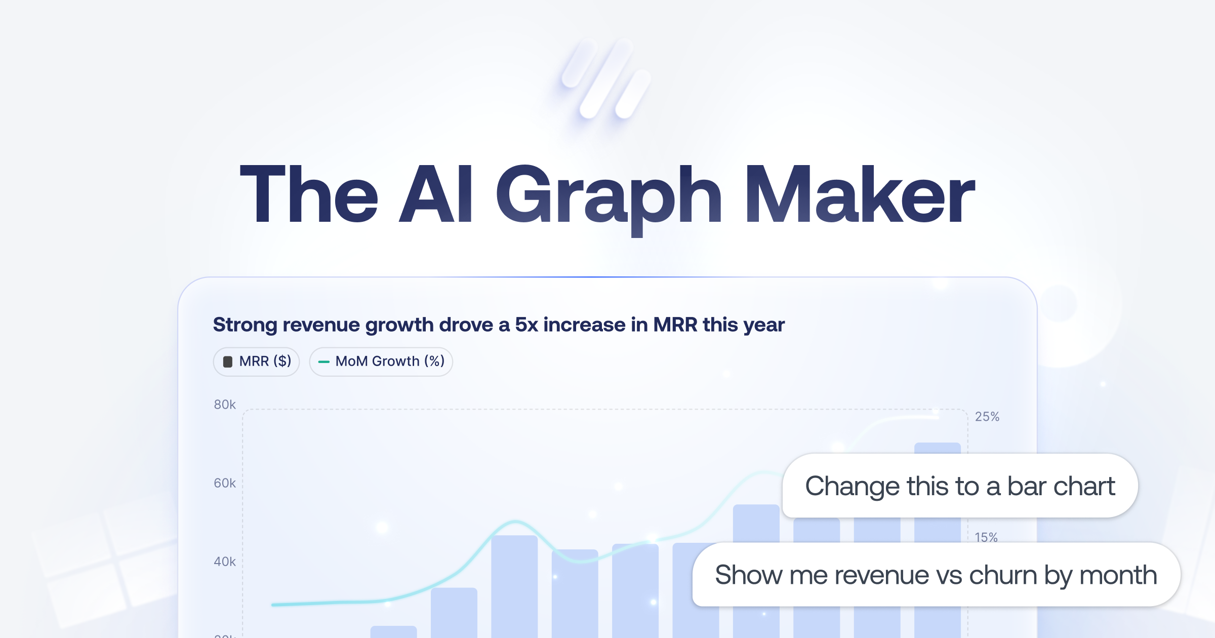
Interactive chart creation
build bar charts, line graphs, pie charts, and other standard visualisation types with your data
Multi-source data integration
connect to spreadsheets, databases, and third-party business tools to pull data automatically
Dashboard boards
combine multiple charts into a single shareable board for thorough data views
AI Insights
the platform can analyse your data and suggest key findings or trends worth highlighting
Branding and customisation
upgrade to apply custom colours, themes, and remove Graphy watermarks from your outputs
Sharing and export
distribute charts and boards via direct links, embed on websites, or share to social media and messaging platforms
Pros & cons
Advantages
- Free tier is genuinely usable; you can create and share charts without paying
- No technical skills needed; the interface guides you through chart creation step by step
- Connects to common business tools and data sources, reducing manual data entry
- Outputs are interactive, letting viewers explore data rather than just viewing static images
Limitations
- Customisation options on the free tier are limited; brand control and advanced styling require a paid plan
- Not suitable for highly complex or specialised visualisations that need custom code or advanced design control
Use cases
Creating weekly or monthly performance reports for management without building them from scratch each time
Sharing sales metrics, KPIs, or team progress with stakeholders via an easy-to-understand dashboard
Building data presentations for client meetings or pitches where visual clarity matters
Monitoring real-time metrics from connected tools and distributing updates across your team
Embedding live data visualisations on a company website or internal portal
Ready to try Graphy HQ?
Pricing
Free
Free
Unlimited charts and boards, basic chart types, data integration, interactive sharing, Graphy branding
Paid (Premium)
Paid (pricing not specified)
Custom branding and themes, watermark removal, AI Insights, advanced customisation options, priority support
Get started with Graphy HQ
Click through to Graphy HQ and start using it now.
- Always free
- No credit card