
MacSIM by Studio Practice
Preview any URL on every Mac screen at once
- Freemium
- macOS
- Developer ToolsCode
- Free plan available
- No credit card
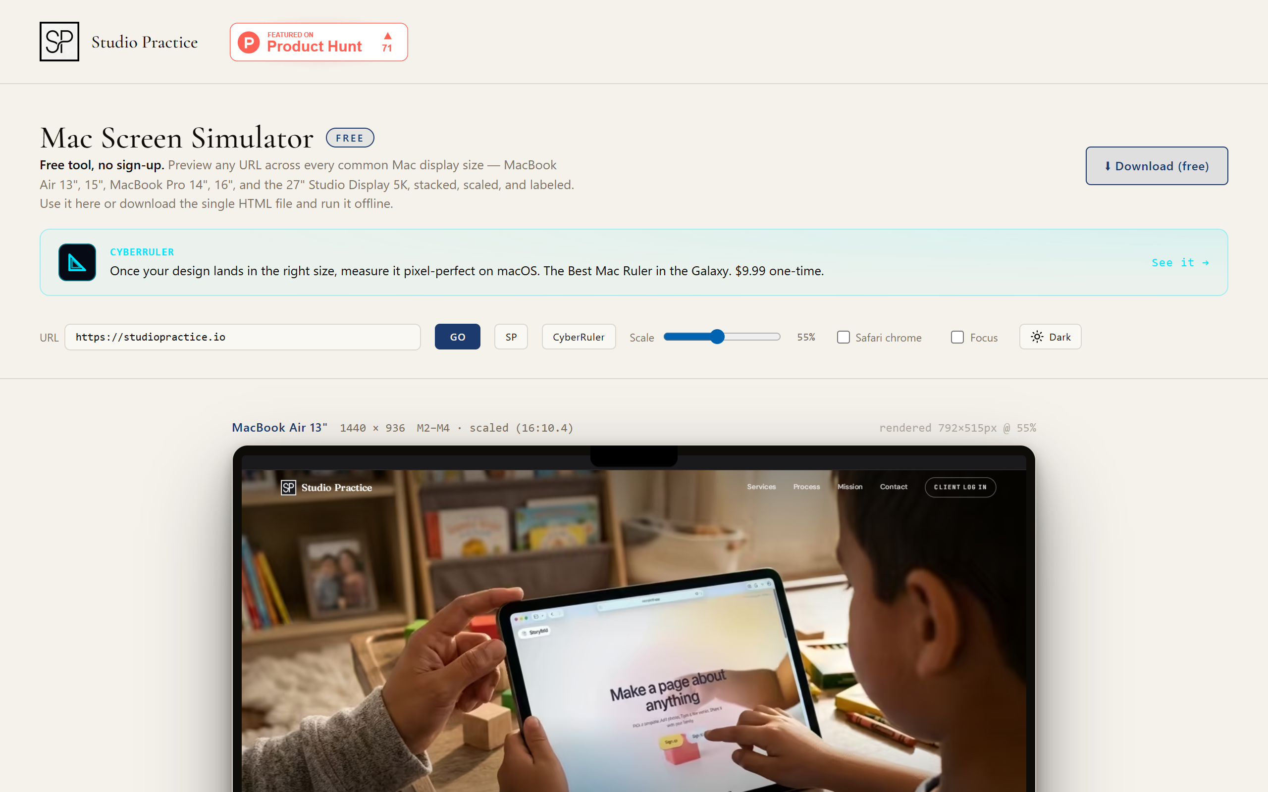
What is MacSIM by Studio Practice?
MacSIM is a lightweight desktop utility for designers and developers who need to check how websites look across different Mac displays. It shows your website simultaneously at five screen dimensions: MacBook Air 13 inch and 15 inch, MacBook Pro 14 inch and 16 inch, and Studio Display 5K. Rather than switching between browser windows or resizing manually, you see all dimensions side-by-side in one view. The tool downloads once and runs completely offline, making it useful for design reviews when you don't have internet access. It's made by Studio Practice for teams focused on the Apple ecosystem who want to ensure their responsive designs work well on the devices their users actually own.
Key features
Side-by-side display of five Mac screen sizes at once
Offline usage after download, no internet required
Simple URL input to test different websites instantly
Native macOS app, lightweight and fast
Pros & cons
Advantages
- Covers all current Mac display sizes in one view
- No account, login, or configuration needed
- Works completely offline after download
- Free version available for individual use
- Purpose-built for Apple devices, not generic responsive testing
Limitations
- Limited to Mac displays only, cannot test Windows or mobile
- Shows visual appearance only, not actual responsive behaviour or interaction
- Requires macOS to run
- Cannot test displays beyond the five predefined sizes
Use cases
Design hand-off reviews: check visual consistency across Mac displays before development
Responsive design verification: ensure websites display correctly on the full range of modern Mac screens
Client presentations: show how designs appear on the specific devices your audience uses
Ready to try MacSIM by Studio Practice?
Pricing
Get started with MacSIM by Studio Practice
Click through to MacSIM by Studio Practice and start using it now.
- Free plan available
- No credit card