
Shadcn UI Kit
Build faster with pre-built assets using the Shadcn UI Kit
- Freemium
- Web
- DesignDeveloper ToolsCode
- Free plan available
- No credit card
What is Shadcn UI Kit?
Key features
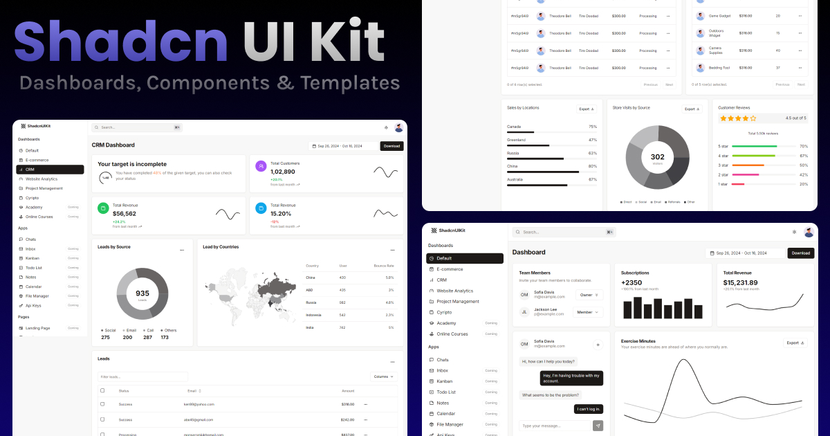
Pre-built React components
ready-to-use UI elements including buttons, forms, navigation, and layouts
Customisable styling
components can be adjusted to match your brand and design requirements
Accessibility built in
components follow accessibility standards for better usability
Code examples
includes documentation and example implementations for each component
Free tier available
freemium model lets you start without payment
Pros & cons
Advantages
- Saves development time by eliminating the need to build common components from scratch
- Consistent design patterns across your application when using components from the same library
- Lower barrier to entry with free tier access
- Components are built with accessibility in mind
Limitations
- Limited to React-based projects; not suitable for other frameworks without adaptation
- Requires some customisation knowledge to tailor components to specific design needs
- Dependent on the library's update cycle for bug fixes and improvements
Use cases
Building internal tools and dashboards quickly with consistent UI components
Starting a new web application with standard component foundations already in place
Prototyping product ideas while maintaining professional-looking interfaces
Teams wanting to enforce consistent design across multiple projects
Adding polished UI elements to existing React applications
Ready to try Shadcn UI Kit?
Pricing
Premium
Pricing varies
Additional components, advanced customisation options, and priority support (specific pricing available on website)
Get started with Shadcn UI Kit
Click through to Shadcn UI Kit and start using it now.
- Free plan available
- No credit card