
Studio Practice
Preview any URL on every Mac screen at once
- Freemium
- macOS
- Developer ToolsCode
- Free plan available
- No credit card
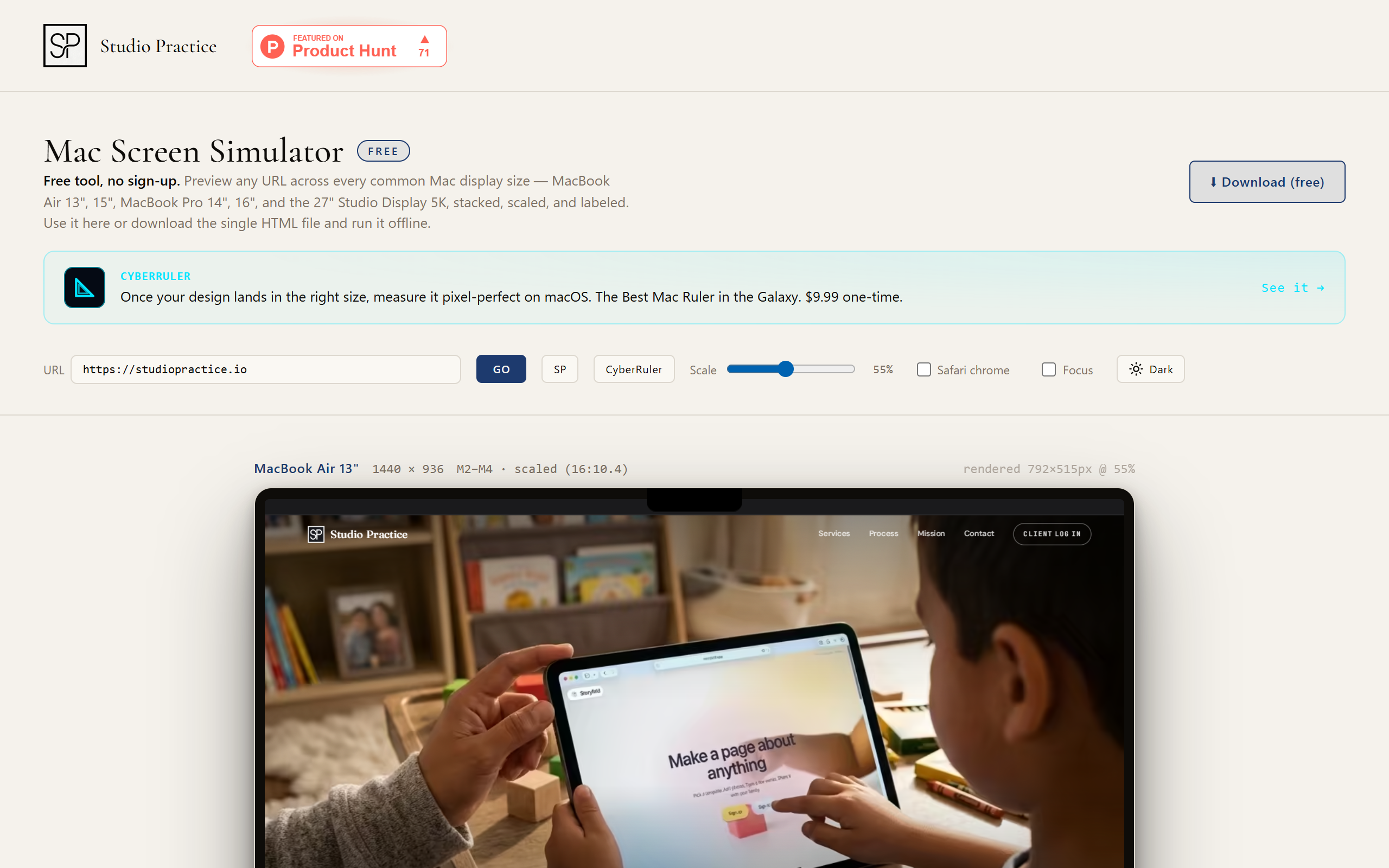
What is Studio Practice?
Key features
Multi-device simultaneous preview
View your website at five different Mac screen dimensions side by side
Offline functionality
Download and use without internet connection after initial setup
Direct URL input
Preview any website by simply entering its address
Browser viewport simulation
Accurately reflects how your design appears in real browsers
Viewport dimensions displayed
See exact pixel dimensions for each device size
Pros & cons
Advantages
- Fast feedback loop for responsive design testing across Apple devices
- Lightweight and downloadable for offline use
- Focused tool that does one thing well without unnecessary complexity
- Tests actual device dimensions rather than generic responsive breakpoints
Limitations
- Limited to Mac screen sizes; doesn't preview on iOS, Windows, Android, or other platforms
- Basic tool focused on a single task; won't replace comprehensive testing suites
- Offline functionality means testing against cached content rather than live sites
Use cases
Responsive design verification for websites built primarily for Apple users
Quick preview checks during development before deploying to staging or production
Comparing layout adaptation across different MacBook Air, MacBook Pro, and Studio Display sizes
Design review sessions with team members using consistent device dimensions
Ready to try Studio Practice?
Pricing
Get started with Studio Practice
Click through to Studio Practice and start using it now.
- Free plan available
- No credit card