Tachyons CSS
Create responsive designs with pre-built CSS, custom coloring, animation, and variable font sizing.
- Freemium
- Web
- VideoAnimation & MotionDesign
- Free plan available
- No credit card
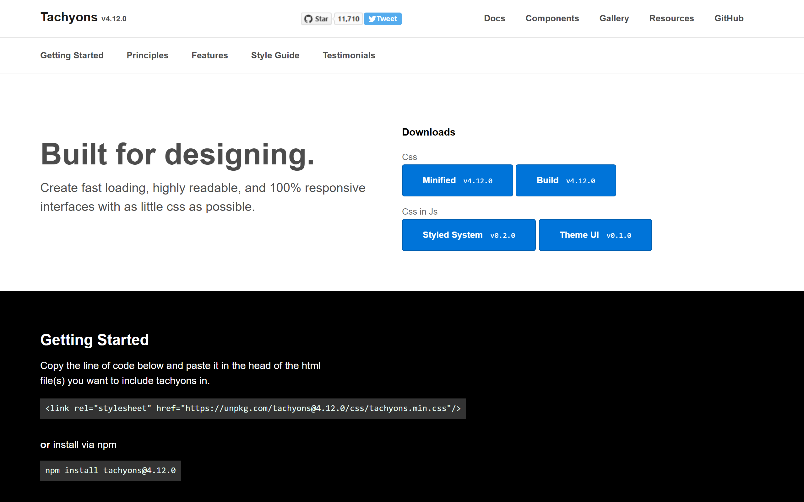
What is Tachyons CSS?
Key features
Utility-first CSS classes
pre-built classes for common styling tasks like spacing, typography, colours, and layout
Responsive design helpers
built-in breakpoints and responsive classes to adapt designs for mobile, tablet, and desktop
Customisable colour palette
ability to define and extend colours within your project
Animation and transition support
ready-made classes for basic animations and transitions
Variable font sizing
scalable typography system that adjusts across different screen sizes
Lightweight
minimal file size compared to many other CSS frameworks
Pros & cons
Advantages
- Free and open source, with no licensing costs
- Fast to build interfaces once you learn the utility class naming conventions
- Forces consistency across projects through a predefined set of values
- Works well for prototyping and rapid development
- Small bundle size keeps pages loading quickly
Limitations
- HTML can become cluttered with many utility classes, reducing readability for some developers
- Requires familiarity with the Tachyons class naming system, which has a learning curve
- Limited ecosystem and community compared to larger frameworks like Tailwind CSS
Use cases
Building responsive marketing websites quickly without custom CSS
Creating design system components with consistent spacing and typography
Prototyping web applications when speed matters more than custom aesthetics
Static site generators and documentation sites where utility-first styling is efficient
Teams wanting a lightweight alternative to heavier CSS frameworks
Ready to try Tachyons CSS?
Pricing
Get started with Tachyons CSS
Click through to Tachyons CSS and start using it now.
- Free plan available
- No credit card